How To compare Analytics For Two Different Periods
Use Crate's Compare periods view to set any two date ranges — Period A and Period B — side by side, with the percentage change worked out for you.
The Compare to previous toggle on a report is great for "this period versus the one before it" — but sometimes the two stretches you care about aren't next to each other. This December against last December. A sale week against the same week a year ago. That's what the dedicated Compare periods view is for: you pick both ranges yourself.
Setting the two periods
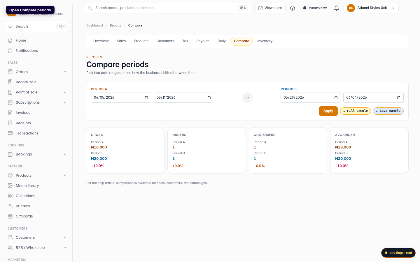
Open Reports → Compare. You'll see two sets of date fields:
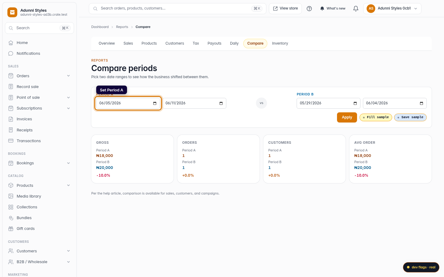
- Period A — pick a start and end date for the first range.
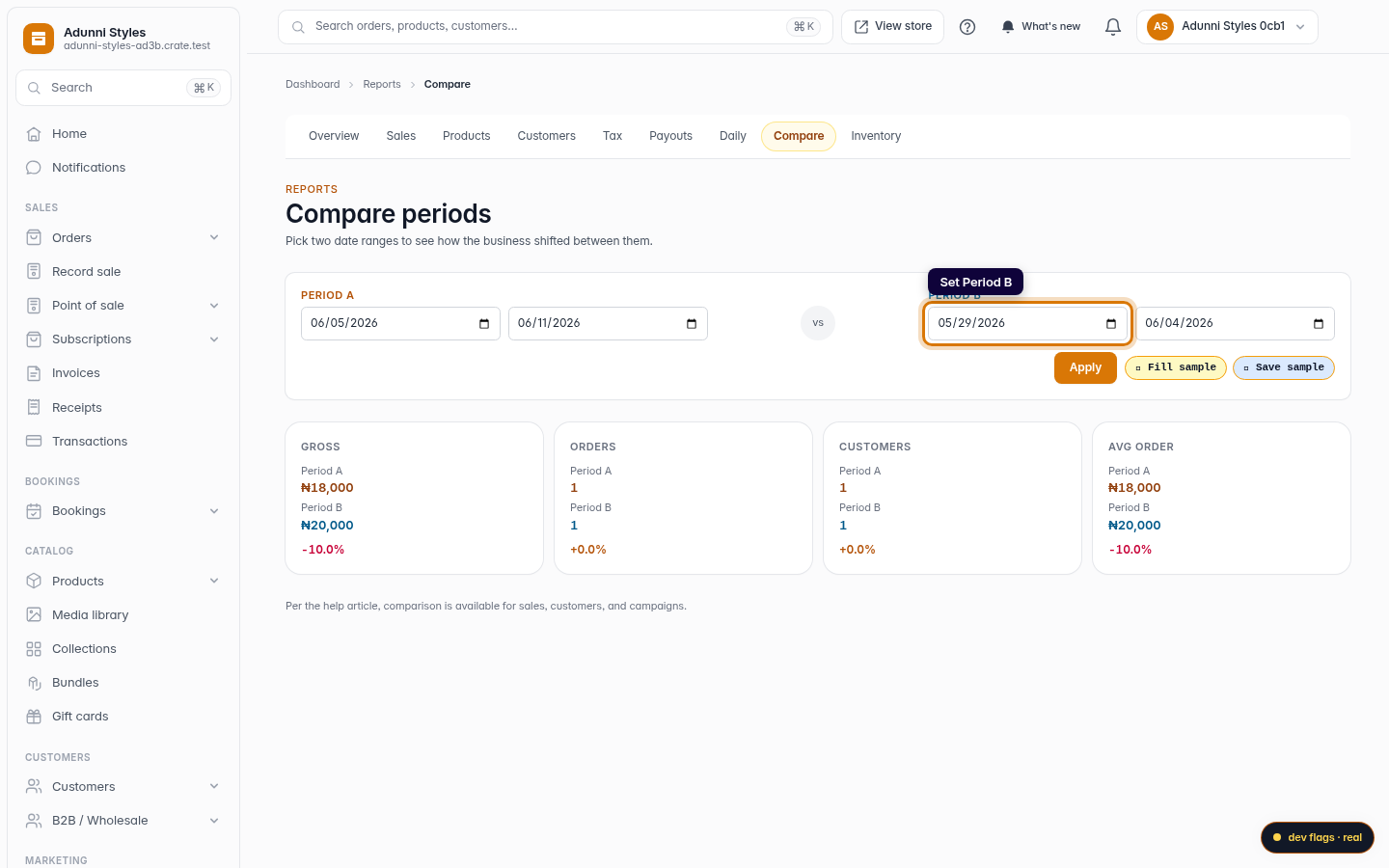
- Period B — pick a start and end date for the second.
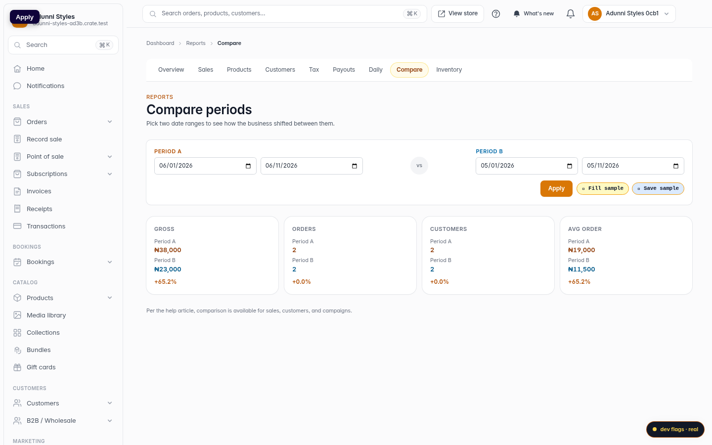
Click Apply and Crate queries both ranges from your completed orders and lays them out side by side.
Reading the comparison
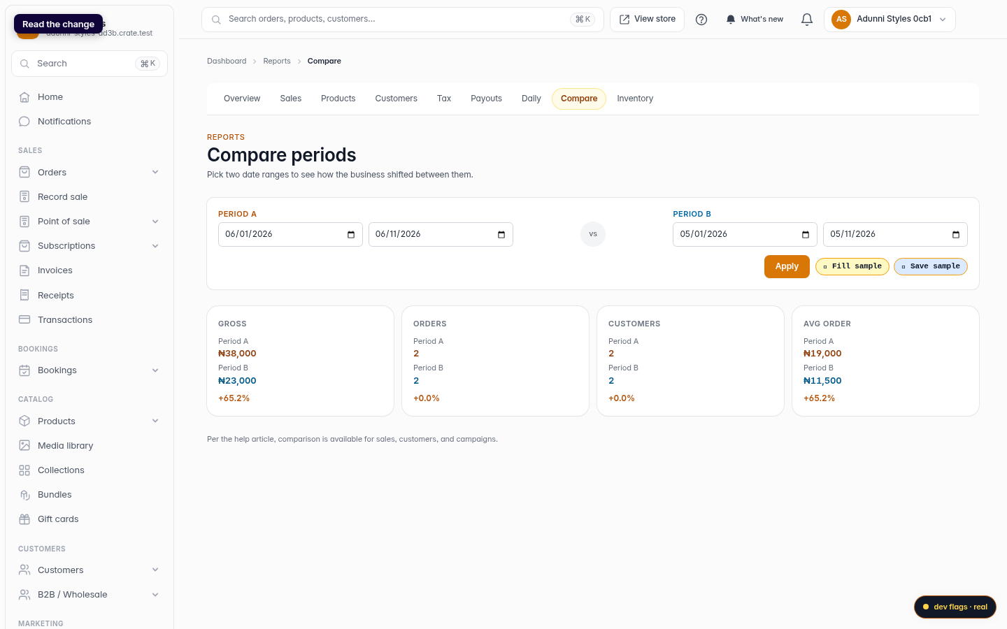
Each metric gets its own tile — Gross, Orders, Customers and Avg order — showing Period A's figure, Period B's figure, and the percentage change from B to A underneath. The change is coloured green when the number went up and red when it dropped, so the story jumps out without any maths.
Tip: Put your two ranges in chronological order — Period B as the earlier window, Period A as the later one — so a green percentage always means "improved since then."
When to use the toggle instead
If you simply want your current period against the window right before it, you don't need this view — just flip Compare to previous on the report itself (see Compare analytics by date range). Use Compare periods whenever the two ranges aren't adjacent.
-
1
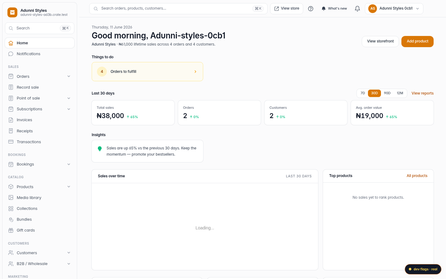
Open Reports
From your Crate dashboard, open Reports in the left sidebar.
Web -
2
Open Compare periods
In the Reports sub-nav, click Compare. This view is built for putting any two ranges head to head.
Web -
3
Set Period A
In the Period A fields, pick the first range's start and end dates.
Web -
4
Set Period B
In the Period B fields, pick the second range you want to measure against.
Web -
5
Apply
Click Apply. Crate computes both ranges and lays them out together.
Web -
6
Read the change
Each tile — Gross, Orders, Customers, Avg order — shows Period A's value, Period B's value, and the percentage change between them, coloured green for up and red for down.
Web